Introducing The Space
At Water and Earth, we see all kinds of “before” spaces. Some yards come to us blank slates. Others have had some degree of previous work done, but are left largely incomplete. Others, like this backyard in Cupertino, have been designed by previous homeowners, but are not suiting the needs or design sensibilities of our clients. In this San Jose Landscape Design Challenge, our goal was to update this Cupertino backyard, turning an outdated living space into a beautiful, modern backyard retreat.

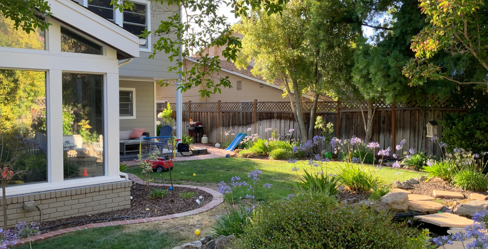
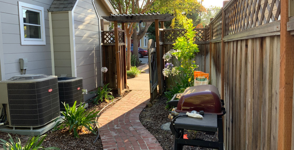
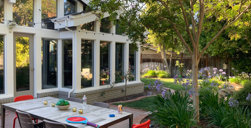
As mentioned, this backyard was far from being a blank slate. Over the years, many design efforts had previously been made in this space. From concrete and paver patios, to brick pathways and small ponds, there were quite a lot of existing design features at play.
However, the style of the design was quite organic and outdated. The homeowners were looking for a space that was more in line with their own aesthetics and streamlined to fit their needs.
A gallery of previous design work in the space. Existing materials included concrete and brick work, a stone patio, small pond, and a fire pit.
Our first step in any design process is to discern what the goals of our clients are for this space. In addition to modernizing and streamlining the design, these clients wanted to be sure a few key elements were included in their backyard update. Items on this list included a covered living space, outdoor dining, and plenty of seating and green space for the kids.
After talking through the must-haves, we hit the drawing board and came back with two design directions.
2D Designs
As with every project we work on, be it here in San Jose or across the country in Richmond, we began by presenting two individual 2D design renderings. Presenting multiple options in this format helps our clients to picture what is possible in their space without feeling shoehorned into a single design direction.
Concept A

The first design concept, Concept A, can be seen above. In this image, homeowners enter the yard from either side using a long, stone stepper walkway to approach their backyard living space. Stepping into the space from the right side of the design, homeowners can either continue along the pathway, or step perpendicularly onto a brand new paver patio right off the back of the home. In this concept, the kitchen, including a new pizza oven, is positioned along the perimeter of this patio, keeping it close to the home.
Continuing along the original stone path, the clients will pass along space for raised vegetable beds on the left, and a large expanse of central turf on the right. This green space gives the clients plenty of room to spread out and gives the kids plenty of room to play. At the end of the stone pathway is a second auxiliary patio which houses a new outdoor fire pit, and bench seating running along the corner perimeter of the yard.
Moving along the edge of the space, the clients step off of this patio onto a secondary pathway which runs past another paver patio. This patio provides additional seating space, as well as an area to enjoy the property’s new, modern water fountain feature.
In the back corner of the property is the existing ADU. In front of this structure is a final paver patio which provides plenty of room for outdoor living, as well as dining space and access to the front of the property.
Concept B

In Concept B, the side approach closely mirrors that of Concept A. In this design, the homeowners enter from the right side of the rendering into their backyard space. Immediately outside the home’s backyard doors is the paver patio from the first design, covered by a pergola. However, unlike in Concept A, the location of the outdoor kitchen and pizza oven has changed. This makes the size of the patio smaller, leaving room for additional lawn space in this design.
The raised vegetable garden from Concept A remains here. The outdoor kitchen is in its new position alongside the property’s fence, atop a new paver patio. This patio connects to the seating area and fire pit from the first design, finished with a corner seat bench.
Because additional paving has been added beneath the kitchen in this design, the hardscaping surrounding the water fountain has been exchanged for additional green space. In front of the property’s ADU, additional planter boxes have been added, bringing color to the third patio living space in the yard. To leave the backyard space, the homeowners step through a fence onto another long walkway, exiting to the front of the home
3D Renderings
After speaking with the clients, they more heavily favored the layout featured in Concept A, with one concession. They wanted to move the kitchen away from the home, without adding an additional patio space. Instead, they decided to incorporate it into the patio in the back corner of the property, making this both a gathering space with a fire pit, and a place to cook. This general layout can be seen in the rendering below.

Also seen in these renderings is a revision to the water feature. The original design was replaced with a water fountain feature wall running parallel to the back fence. Beneath this fountain, a paver patio extends from the ADU to the opposite fence, partially covered by an opaque pergola. The size of this patio would be revised in the final design, narrowing to take the place of the original concrete stepper seen here.

Also on display in these renderings is the color and depth provided by the landscaping in this project. Punctuating every moment of hardscape design is greenery, trees, or other flowering plants. It’s important to us that modern design does not become harsh, or uninviting. Intelligent plantings are a powerful tool in creating a space that feels equally welcoming as it does modern and updated.

The matching paver patio directly outside the back doors of the home is covered in a light shade pergola, and allows room for relaxing on a new set of patio furniture. The homeowners can follow pathways both to the far side of the yard, or back through the gate toward the front of the home.

After seeing these renderings the clients were excited about the overall direction of the space. Still, they had a few items they wanted to see reworked or reimagined, including materiality of the first auxiliary patio, privacy screens for the back patio, as well as minimization of the hardscaping in front of the water feature.
Using this feedback, we quickly moved forward with a revised set of renderings.
Revised Renderings
Revisions made to the first round of renderings are reflected below. These changes included switching out the matching patio pavers on the patio outside the home for a wood composite. This adds some additional dimension and color, and breaks up the overall hardscaping plan. This change was adapted in the final design.

The second change made that was included in the final project was a minimization of hardscaping in front of the water fountain. Instead of extending the paver patio across the yard to the ADU, the dimensions have been reduced, leaving space for additional lawn.

Finally, sometimes changes are added to renderings that do not make the final design. In this project, one of those changes were pergola screens, intended to add more privacy to the largest covered patio at the back of the yard. In the end, the clients decided against the addition. Also seen in these renders is a pathway that bisects the yard. This was also decided against, in favor of the original pathway flush with the perimeter of the yard.

After seeing these final revisions, the homeowners were excited to greenlight the project, and we moved ahead with construction.
The Finished Space
In this San Jose landscape design, the final product matched the renderings nearly perfectly. To us, this means a dream space has been realized for the homeowners.
Stepping out the back doors of their home, our clients now step down immediately onto their new, covered deck. This vantage point allows you to survey the rest of the yard during any kind of weather.

In these images you can see where certain elements were kept and excluded from each round of revision. While the wooden deck was incorporated, the additional privacy screens and central paver walkway was excluded in favor of earlier rounds of design.

The water feature at the back of the yard is intricately tiled, and adds both movement and ambient noise to the space. This is a modern upgrade on the element, a big departure from the outdated pond the property began with.

Finally, the outdoor dining space in front of the property’s ADU is finished with hanging string lights and landscaping.. From a cracked concrete patio to a sleek and modern space, the new dining area merges seamlessly with the surrounding design. Pathways encourage movement throughout the property, while materiality and lighting ties each space together.

Reviewing the finished space, we are thrilled with how this San Jose landscape design challenge turned out. Beginning with a space that was outdated, lacking function, and at odds with the homeowner’s sensibilities, we were able to reinvision the space as a sleek, modern yard with space for everyone.
Using updated materials, intelligent planting and lighting design, and working closely with the clients to fine tune each rendering and revision, the final product speaks for itself.
This backyard is a modern, innovative retreat that offers space for kids to place, and room for adults to unwind after a long day at work. It can be challenging to look past design that is already in place and see the potential for something new and beautiful. But at Water and Earth, we do that every day. We think the results speak for themselves.
Get more San Jose landscape design inspiration.
If you’re eager for more behind the scenes at finished and upcoming design projects, check out our blog! To keep up with us in real time, follow us on Instagram.






Comments