Borello Ranch Backyard Design - Project 3
- WELD
- Jan 25, 2022
- 7 min read
Updated: Jan 27, 2022

Introducing The Space
All outdoor spaces bring something different to the table, and come with their own unique set of challenges, limitations, and design opportunities. In the case of the third property within the Borello Ranch Estates community, the backyard was notably large.

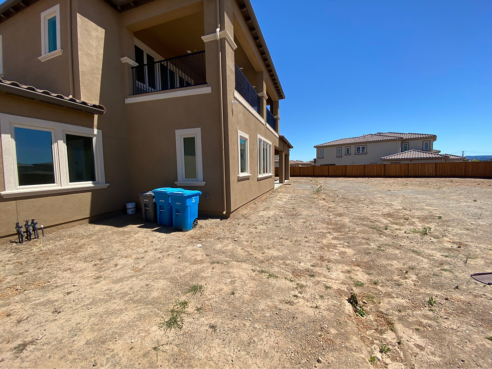
Looking toward the house from the far corner of the lot. This backyard is very large compared to our other Borello projects.
While you may assume that the more room you have to design, the better, this is not always necessarily the case. It is true that designing in small spaces can present logistical challenges that need to be worked around. But there are very real challenges when designing in larger spaces as well—particularly when it comes to managing the budget of the project.
Naturally, the more space you have to work with, the more material and design elements you will need in order to fill it. Under-design the project, and the backyard can be left feeling empty or unfinished. Let your imagination run away with you, and you can create a design that comes in way over the homeowner’s expected budget.
The challenge then becomes using and filling the space beautifully, without disregarding budget parameters, timelines, and overall cost. When we set about designing for this large backyard space, that note was at the forefront of our mind. Our client’s had a budget, and were careful to work with it as we filled the space.
The Wishlist
These homeowners had a wishlist that is similar to many of our other clients, including a few additional, less frequently requested elements. Pool, spa, kitchen, fire pit, and covered living space all made the list of must-haves. However, these homeowners were also interested in amenities such as a basketball court or finished recreation area, and outdoor bathroom.
When it came to desired aesthetics, the clients had their hearts set on a firmly modern-minded approach. With all that in mind, we hit the drawing board and came back to present our initial renderings.
Concept A

Concept A
Concept A begins at the far end of the space, as a walkway guides the clients in from the driveway, past a large lawn area. Because the space was so large, we were able to devote more square footage to an open play area, giving kids plenty of room to play, and dogs room to run. This lawn area is divided from the rest of the space using a carefully placed seating wall, which creates a functional separation, providing additional seating while also keeping stray soccer balls out of the pool.
As the homeowner reaches the end of the walkway, they are led onto a large paver patio. In the center of the patio is a rectangular swimming pool and spa, flanked on the left by a pergola-covered deck. Unlike many covered living areas, this patio houses more than just chairs. Against the far end is an outdoor restroom and storage area. In the middle sits the first of two fire pits included in this design.
Behind the pool at the back of the property you see the second, larger fire feature and additional seating. Next to this, you see another element that is unique to this space—a putting green! This is one of two approaches we took towards a finished recreational area in this backyard.
When it came time to place the kitchen within this design, we decided to optimize accessibility and functionality by placing it inside their home’s existing covered patio area off the back of the house.The design is capped on the other end by another, smaller turf area. We finished the space with carefully placed landscaping for both color and privacy, and lighting to increase both ambience, safety, and nighttime functionality.
Concept B

Concept B
As you can see in the photo, Concept B reflects much of what was included in Concept A, with some minor adjustments to placement and details. The pool, which runs parallel to the home in Concept A, is placed perpendicularly in this design.
Also rotated is the covered living space. While it still houses the outdoor bathroom, the fireplace is removed. In its place is the new outdoor kitchen, moved out further from the house, now seen with an accompanying island and dining set up.
The firepit which is no longer beneath the pergola now sits between the pool and the covered kitchen, while Concept A’s larger fire feature remains largely unchanged. Also familiar is the putting green, which has simply changed from a curving organic shape, to a rectilinear design.
After presenting both options to our client, they loved the placement and design of Concept A. However, similar to our homeowners from Project 2, they were interested in the idea of a sunken area within the living space. Before moving to the 3D renderings, we decided to present a third concept to ensure that our client’s were confident in the final direction of the design.
Concept C

Concept C
The third concept presented takes much of the placement and shapes from Concept A, while adding some additional design elements.
Our clients are still led into the space from the driveway by a walkway. However, instead of continuing past the lawn to the patio space, they are led first onto a backyard basketball court. This adds another recreation area in addition to the putting green still seen at the back of the space.
From here, our homeowners find themselves on the patio. The pool and the covered living area remain in the same location as seen in Concept A. However, a few changes have been made. First, we moved the kitchen out from near the house, and placed it under the pergola. This left us open to incorporate a covered swim up bar, adding additional fun and function.
Then, to incorporate the sunken area our clients were interested in, this covered living space has been sunken three feet beneath the elevation of the adjacent patio.
Budgeting and Back to The Drawing Board
Now, our client absolutely loved the design presented in Concept C. We even went as far as to render the entire design in 3D.

A rendered version of Concept C, looking out from the back corner of the yard, over the pool and towards the swim up bar and sunken covered living area.
However, upon reviewing it, we realized that we had run into the exact problem we were worried about from the start—a large space whose design had begun to cost more than the client could afford.

An aerial rendering of Concept C, including an overview of the pool, sunken space, landscaping, and putting green which is just visible towards the right edge of the frame.
While we would have loved to make this exact design a reality, making sure that the homeowner can actually afford to finish their dream space is priority number one. After giving our client some time to think about what was most important to them, we regrouped and presented what ended up being the approved design.
This kind of process goes to show that, while the design process is not always seamless, it’s worth taking the time to do right. It’s easy to present a great design, but if both the designer and the client know that there isn’t the budget to make it a reality, it only makes sense to slow down and find a more realistic solution.
It may take more time, but the result is a space that is both beautiful and functional, but also realistic and guaranteed to be completed on time, without setbacks.
The Approved Design
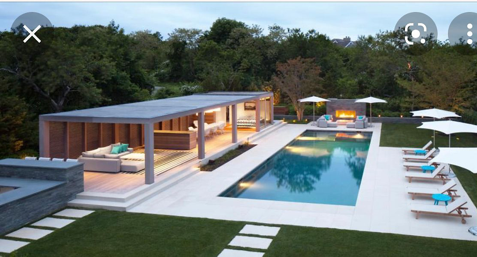
After taking time to think, our client came back to us with some inspiration photos by a New York based design firm, LaGuardia Design Group, seen below.

This design features a pool similar to those seen in our initial concepts, but also features one long, linear covered living space.
We took this inspiration and ran with it. In our final renderings, you see the initial covered living space transformed into a longer linear space towards the back of the property. Beneath is ample seating, as well as the outdoor bathroom and storage.

The final layout and rendering of the space, featuring the long, linear covered seating area, as well as a long fireplace in the place of the former covered swim up bar.
Next to the pool is the fireplace feature, still sunken a bit into the elevation to retain that separation our clients were after in revision C. In this design, the kitchen is back under the covered patio close to the house, as in Concept A. The putting green has been moved from the back of the property to the front, winding around the side of the home, with the walkway winding through.

Another look at the revised design. The wall separating the lawn from the patio has transformed into a functional fire feature. The long, covered patio sits at the back of the property.
Final elements from Concept C, such as the basketball court and much of the landscaping, remained in their original spot for this final design.
Final Renderings

The final rendering of the space. Looking out over the pool towards the fireplace and sunken living area. The linear pergola is visible on one side, while the putting green has been moved toward the house, intersected with a contrasting walkway.
After we got the green light from the clients after presenting the initial 3D renderings, we were excited to come back and develop a final set of images that refined the space. While the first set of photos conveyed the design accurately, this final set plays with materials and lighting.
In these images you see board form on the fireplace and fire wall, and a variety of Techo Bloc pavers underfoot. In these renderings, it is also easier to see the strategic privacy planting around the perimeter of the property.

A view from the conversation pit. A mix of TechoBloc pavers add dimension and visual interest, while a long seating wall adds functionality to the space.

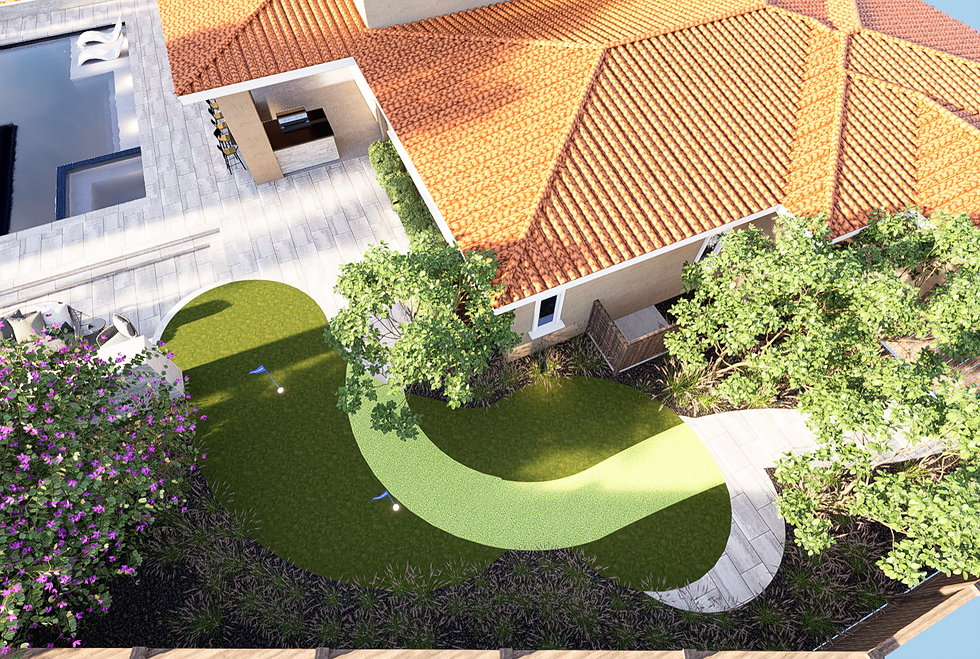
An aerial view of the putting green, with the dimensional walkway running through.
At the end of the day, this design went through many revisions before this beautiful linear concept took shape, and the clients were more than thrilled with the final layout. It’s projects such as these where we are reminded that the time we take in the initial steps of each project are critical.

An aerial rendering of the final design, including all of our clients must haves without neglecting their budget concerns.

A rendering of the grassy area and recreational basketball court at the far end of the property. This green space offers both color, fun, and function to the homeowners.
Producing a design plan that looks great is easy. But making sure that the plan serves all of the needs of our homeowners, including both aesthetics, functions, and yes, even budget, can be a bit of a longer process. At the end of the day, all of the feedback, tweaks, and redesigns are more than worth it to present a final design that hits all of these marks, and does it well.
To Be Continued!
This project is currently coming to life. Construction is underway, and we plan to have the space completely finished by April, 2022. We are excited to share the finished results with you.
In the meantime, if you are eager to see more of our design transformation, check out the blog for more complete design write ups, or give us a follow over on Instagram. We love hearing your feedback.

Comments